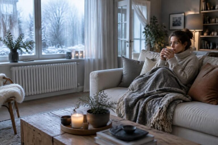
Colors & materials: which pairing avoids a gloomy effect?
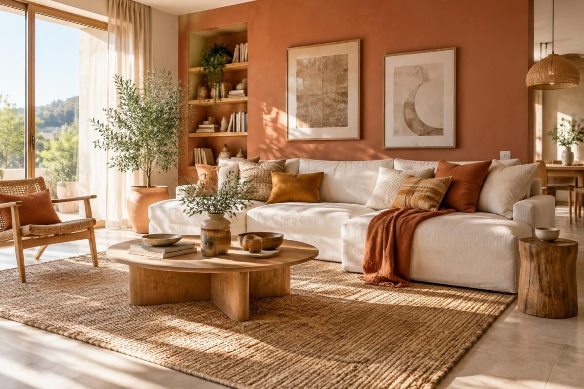
Hi, Olivia here. The duo that avoids a gloomy look: warm colors, like terracotta and ochre, with natural materials such as light wood and textured linen. Keep a light base, then add a generous texture or a pop of color to add depth. The secret is luminous contrast: the room stays lively without feeling cluttered.
What you can do now
- Choose a light dominant shade, such as off-white or beige.
- Add a warm color in small touches: terracotta, ochre, or olive green.
- Pair light wood with textured linen or wool.
- Limit patterns to two or three per room, depending on the size of the space.
- Test samples at different times of day before deciding.
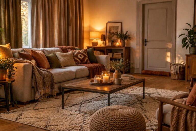
A velvet cushion or a rattan basket can be enough to warm up a slightly gloomy corner. To fine-tune your choices, check out these tips for harmonizing colors and materials and these ideas for combining patterns and textures without creating clutter.
Color and material combinations that warm up a room
A shade is never perceived on its own. Velvet absorbs light and makes a color look deeper, while metal and glass reflect more light. Light wood, meanwhile, softens contrasts and adds a sense of warmth.
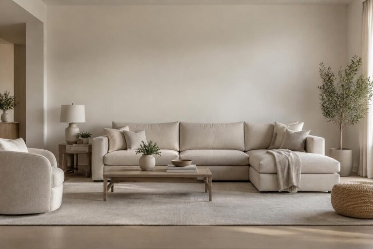
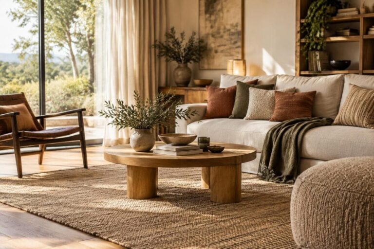
“A calm material can let a bold color breathe.” Picture a beige linen sofa, two terracotta cushions, and a light wood coffee table: the elements complement one another without competing.
| Color | Material to pair it with | Desired effect |
|---|---|---|
| Terracotta | Linen, light wood | Soft, natural warmth |
| Ochre | Rattan, wool | Depth and light |
| Olive green | Wood, matte ceramics | Soothing atmosphere |
| Deep blue | Velvet, brushed metal | Elegant contrast |
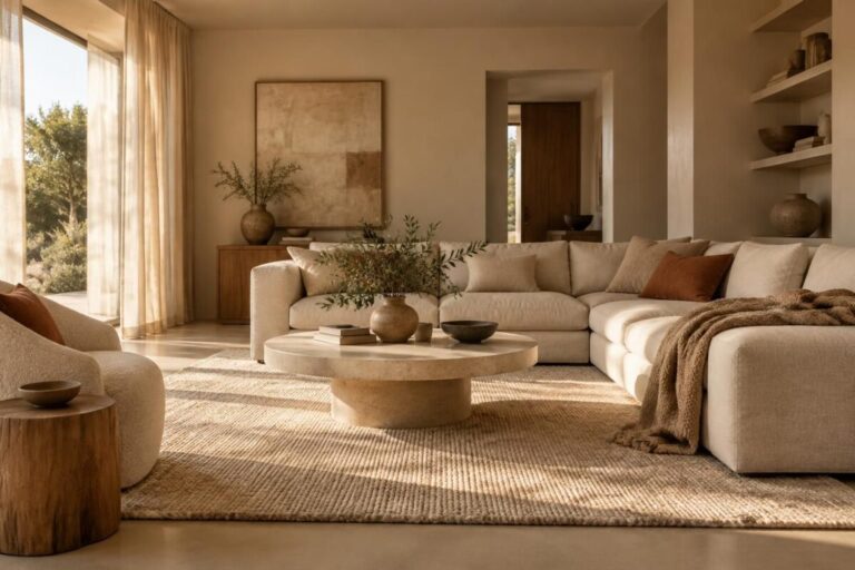
A little decorating anecdote: in a living room with gray walls, a jute rug and two clay-colored cushion covers were enough to make the whole space feel more welcoming. There’s no need to change everything: a few well-chosen materials can transform the atmosphere.
A three-step method to avoid a dull decor
- Step 1: choose a dominant color, then one or two accent shades. A limited palette makes it easier to create balance.
- Step 2: vary the textures: pair a smooth surface with a more pronounced texture, such as wood with textured linen or velvet.
- Step 3: look at the samples in your home, both in daylight and in the evening. A matte or glossy finish can change how a color looks.
If it’s a small, dark space, opt for a light base and warm accents on a few accessories. If it’s a large room that feels a little cold, add cozy materials such as wool, velvet, or rattan.
For patterns, stick to one bold print and tie it in with the rest through a shared color. This harmony of textures lets the eye move around and avoids a cluttered look.
A simple palette for a lively interior
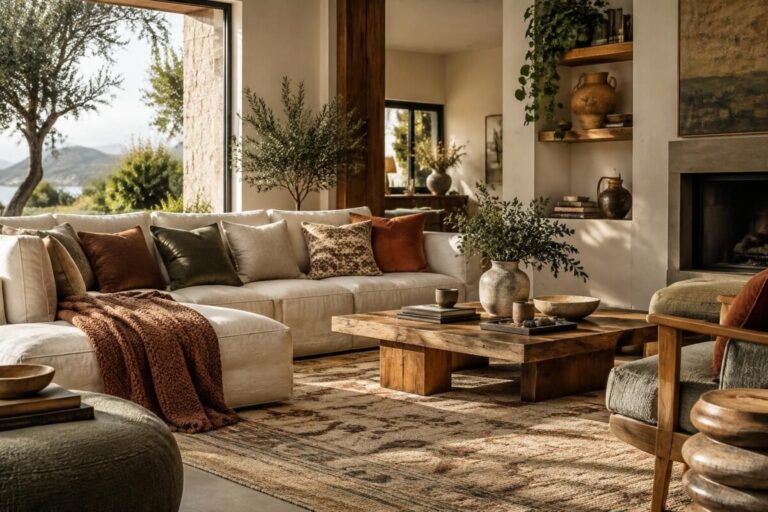
The terracotta and light wood duo works well to warm up a room, while ochre pairs beautifully with linen and rattan. For a fresher feel, choose a rich blue with wood and a touch of brushed metal. In every case, keep a neutral area to create luminous contrast.
Avoid piling several bold textures next to one another. A graphic rug, highly patterned cushions, and a velvet armchair can quickly overwhelm the eye: space them out and leave a few surfaces plain.
Quick pointers for choosing your duo
Does a color seem too cold? Warm it up with wood or a natural textile. Does a shade look dull? Check the lighting and finish first before adding another color: sometimes the problem is the surface, not the palette.
Which colors help avoid a gloomy look?
Terracotta, ochre, and some soft greens add warmth. Pair them with a light base and natural materials to keep the overall look balanced.
Which materials pair well with light wood?
Linen, wool, rattan, and matte ceramics pair easily with light wood. Choose one or two textures to keep the decor light.
How many patterns should you mix in a room?
Two or three different patterns are often enough, depending on the size of the room and how bold they are. Tie them together with a shared color.
How can you check a color before choosing it?
Test a sample on the intended surface and look at it in natural light, then under the evening lighting. A matte, satin, or glossy finish also affects how it looks.
Thank you for your interest; Olivia. P.S. I’d be delighted if you left me a comment at the end of the article.