Colors & Materials: Should You Dare to Use Warm Tones?
Hello, it’s Olivia.
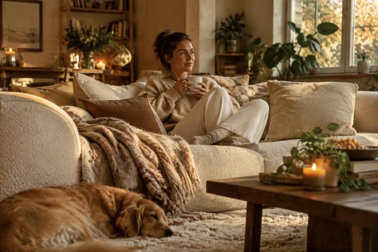
Yes, warm tones deserve a place: when used in moderation, they make an interior feel more welcoming without making it darker.
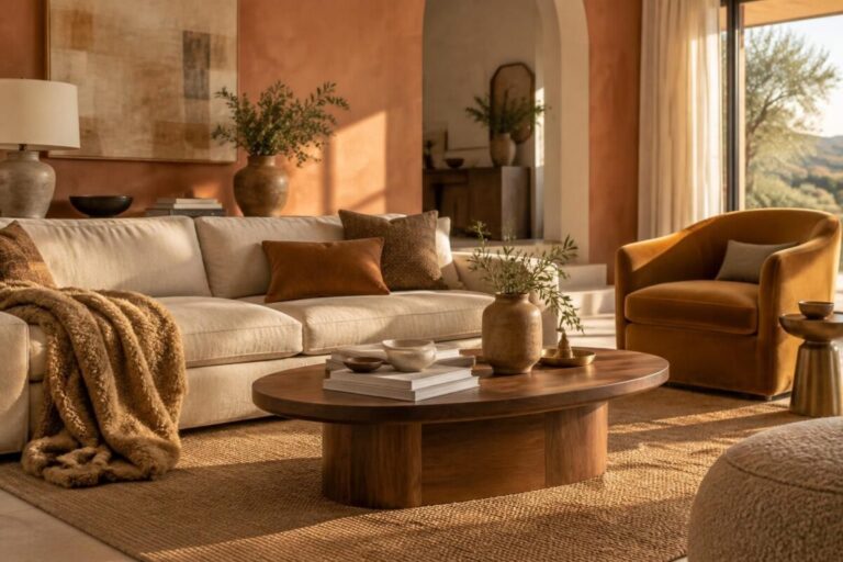
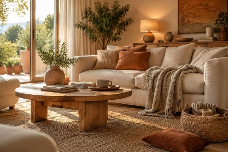
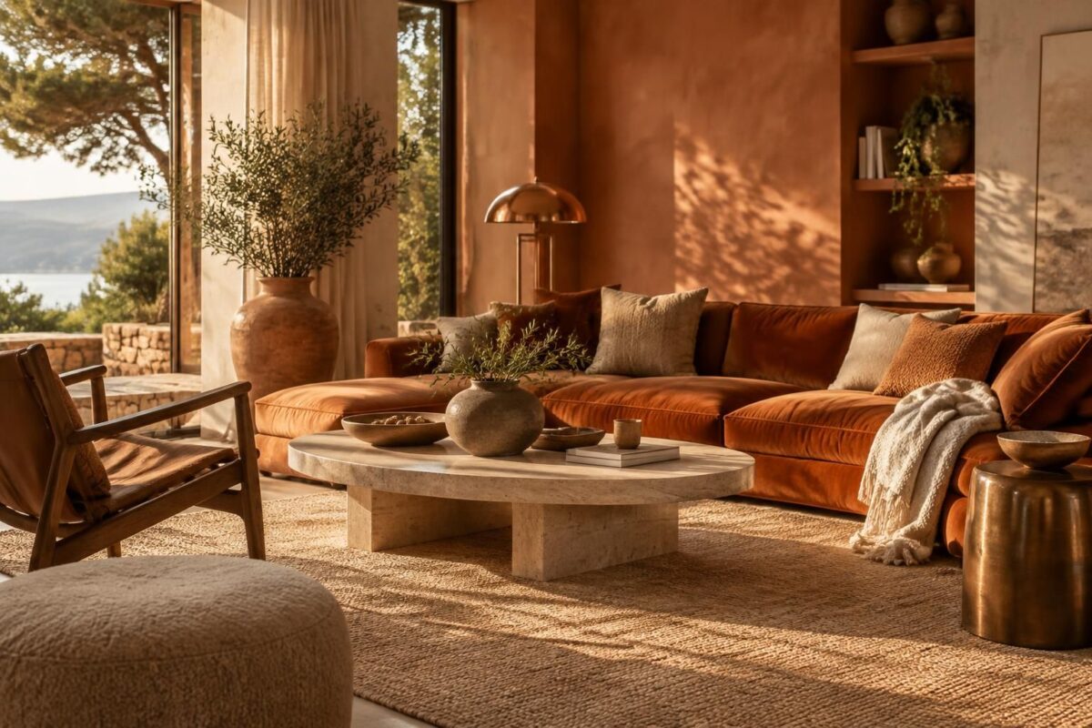
Ochre, terracotta, rust, or copper can bring a room to life, especially when paired with light shades and natural materials.
The secret isn’t to use them everywhere, but to choose one bold shade and balance it with wood, linen, or a well-chosen velvet.
Try this right now
- Choose just one dominant color, such as ochre or terracotta.
- Try it on a cushion, vase, or print before repainting.
- Pair it with a light base: ecru, off-white, or soft beige.
- Add a natural material, such as wood, rattan, or linen.
- See how it looks in the morning and evening, because light changes colors.
If your room feels a little cold, these ideas for warming up a living room that lacks a cozy feel can help you find the right balance. To create a welcoming atmosphere without making the space feel heavy, also discover how to warm up a room without making it darker.
Warm tones or a neutral palette: which should you choose?
A neutral palette makes a space look larger and creates a sense of calm. Warm tones, on the other hand, add depth and a feeling of intimacy; they work especially well in a living room or dining nook.
In a small studio apartment, there’s no need to choose between the two. Keep a light base as the main feature, while a terracotta armchair or a few ochre accessories create a focal point without overwhelming the room.
| Color or material | Effect in the room | Easy pairing |
|---|---|---|
| Ochre | Adds light and character | Ecru and light wood |
| Terracotta | Creates a warm atmosphere | Beige and linen |
| Rust | Adds a rich, distinctive touch | Cream and velvet |
| Copper | Makes a decorative accent sparkle | Wood and sandy tones |
A simple rule of thumb: keep large surfaces fairly light and save the boldest colors for pieces that are easy to move.
A practical example of how to balance warm colors
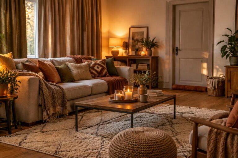
Imagine a living room with off-white walls, a beige sofa, and an oak floor. Two rust-colored cushions, a terracotta vase, and a copper lamp are enough to create a visual thread throughout the room.
If you then add a large red rug, brown curtains, and several orange objects, the eye won’t know where to rest. A well-highlighted warm color often has more impact than several competing accents.
Three steps to using warm tones without getting it wrong
- Start with the light. In a room that gets little sun, opt for soft ochre or light terracotta. In a very bright space, a deeper rust shade can add contrast.
- Choose what to use it on. Start with a textile, artwork, or small piece of furniture. A material like velvet intensifies the color, while linen makes it feel lighter.
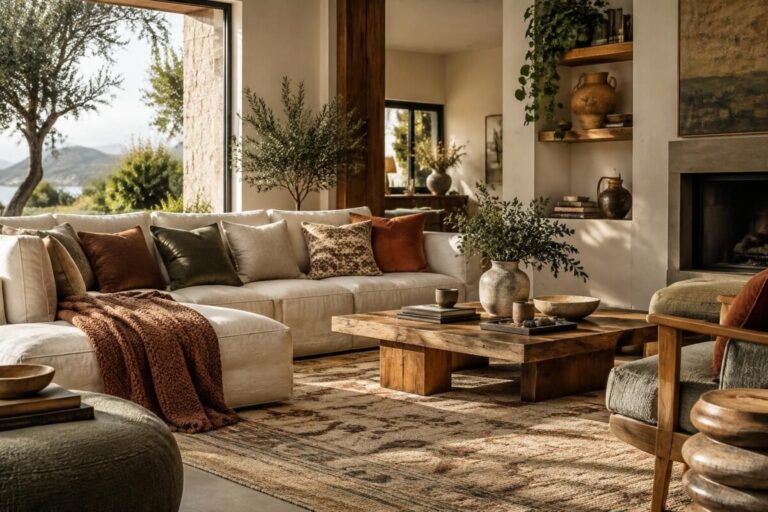
- Balance the textures. Pair colorful accents with wood, matte ceramic, or natural fibers. The overall look feels more lively and less uniform.
A common mistake is choosing a shade based only on how it looks on a screen or under store lighting. Instead, place a sample in the room and look at it at different times of day: this simple test can save you a lot of second-guessing.
Can warm tones work in every room?
Yes, as long as you adjust their intensity to suit the room’s purpose and lighting. In a bedroom, rust accents on a throw or headboard create a warm atmosphere without making the room feel too stimulating.
In an entryway, a touch of terracotta or copper can add character right from the threshold. The right amount is whatever you enjoy living with every day: start small, then adjust based on how it feels.
Do warm tones necessarily make a room darker?
No. A light base, good lighting, and a few ochre or terracotta accents can create a warm atmosphere without making the space darker.
What colors go with terracotta?
Terracotta pairs easily with ecru, beige, off-white, and natural wood. For more contrast, add a few olive green or deep blue details.
How can you try warm tones without repainting?
Introduce them in small touches with cushions, a throw, a copper lamp, ceramic objects, or a print. These items are easy to move if you want to change up the palette.
What materials should you choose with a warm palette?
Wood, linen, wool, and matte ceramic complement warm colors beautifully. Velvet adds more depth, while natural fibers create a lighter look.
Thanks for reading! If this topic resonates with you, share your experience in the comments. — Olivia